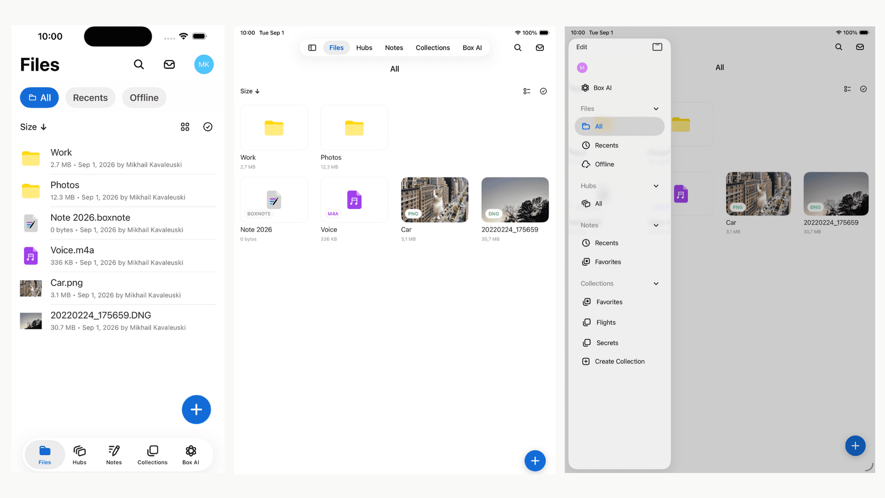
For years, the Box iOS app carried two parallel navigation containers. On iPhone we ran a classic tab bar; on iPad we ran a split-view with a sidebar. The two were never quite the same. The sidebar was maintained separately from the tab bar and its sub-tabs, so it drifted out of alignment with the phone layout. Programmatic navigation — deep links, state restoration, "open this collection" — had to be implemented twice, once per container, and the two implementations had a habit of disagreeing in edge cases. Every time we added a top-level destination, we paid the tax twice.
When Liquid Glass landed in iOS 26, we wanted to adapt the app to the newer look. While planning that work, we discovered the UITab/UITabGroup API — available since iOS 18 — and decided to adopt it by rewriting the home screen on top of it. We chose it because it unifies the iPhone and iPad experience so the app feels consistent. And because the system component is built to support different form factors, we can worry less about edge cases.
This is the story of how we adopted that API in a high-traffic surface of a large production app: what we gained, what we had to build by hand anyway, how AI helped us and the friction of shipping against Xcode 26 APIs before our CI could fully validate them.

Building the adaptive navigation
One adaptive UITabBarController using UITab and UITabGroup
The centerpiece of our build is a single UITabBarController subclass, TabBarController, that replaces both the old iPhone tab bar controller and the iPad split-view controller. The adaptive behavior is essentially one line of intent:
private func configure() {
    // Set adaptive mode
    mode = .tabSidebar

    // Set tabs
    tabs = tabsBuilder.tabs
}
Setting mode = .tabSidebar hands the system control of the top-level navigation. On a compact iPhone, it renders a regular tab bar; on the iPad it can render an elevated tab bar with sidebar or a regular tab bar depending on the window size. We no longer have to control that manually. We hand the tabs to UIKit, which lays them out and manages transitions.
Because UIKit adapts the presentation to the device type, this foundation positions the app to support different form factors. The same navigation model can adapt to them instead of requiring a separate navigation implementation.
The destinations themselves are produced by a TabsBuilder that maps our own lightweight configuration model into UITab and UITabGroup instances. The config is just data — the key field is children:
struct Tab: Equatable {
    // ...
    var children: [Tab]? // has children → build a UITabGroup, otherwise a UITab
    // ...
}
The builder walks that tree and, for each node, produces a group or a tab depending on whether it has children:
// Top level tabs (all of them are groups in the example)
var tabs: [UITab] = unifiedTabs.map {
    buildGroup(from: $0, parent: nil)
}

private func buildGroup(from config: Tab, parent: Tab?) -> UITab {
    var group: UITabGroup

    // ...

    // A child with children becomes a nested UITabGroup,
    // a child without becomes a UITab.
    group.children = children.compactMap { child in
        guard child.children != nil else {
            // We need a regular tab
            return buildTab(from: child)
        }
        // We need a group
        return buildGroup(from: child, parent: config)
    }

    // Custom navigation controller to support showing child tabs in a compact window.
    // More about it in the next section!
    if parent == nil {
        let navigationController = GroupNavigationController(group: group)
        group.managingNavigationController = navigationController
    }

    // ...

    return group
}

private func buildTab(from config: Tab) -> UITab {
    // Configure a UITab and return it (title, view controller, ...)
}
Navigation consistency between iPhone and iPad
Because the same UITab tree drives both form factors, most of the consistency we used to achieve by hand now comes from the system. We no longer maintain separate iPhone and iPad implementations — even the old sidebar code is gone. Only visual tweaks on top of the system component remain.
There are still a few limitations, though.
Sub-tabs on iPhone are manual. In a regular-width layout the system renders a group's children in the sidebar. In a compact layout there is no equivalent. That's exactly why every root group got its own GroupNavigationController earlier in this section. That controller hosts the compact sub-tab bar, built from the group's children:
// Custom UI component to show sub-tabs and handle interactions
let view = SubTabBar(items: group.children)
We then insert that view into the view controllers we present — for example, from the navigation controller delegate, when a root view controller is about to appear:
override func navigationController(
    _ navigationController: UINavigationController,
    willShow viewController: UIViewController,
    animated: Bool
) {
    // Add / update the sub-tab bar here
}
No full control over the sidebar.UITab is convenient, but not fully customizable. We can set a custom header and footer and customize the cells through UIContentConfiguration, but there's no API to change how the sidebar itself looks (e.g. its background color).
Easier to extend, less code to maintain
Because the whole structure is a data-driven tree of Tab entries (as shown above), reorganizing the app's top-level UI is now just a matter of reordering entries. Now, the system handles the layout for both the iPhone tab bar and the iPad elevated tab bar with sidebar.
This structure also made it easy to integrate the new "Notes," "Hubs," and "Box AI" tabs into the app. Adding these tabs was mostly a matter of adding a destination to the arrangement, rather than threading a new screen through two separate containers.
Collapsing two containers into one also let us delete a large amount of legacy code that was needed to support separate containers. AI tools helped surface code that was no longer needed and assisted with the refactor — a genuinely tedious task given the large amount of old code spread across the project.
Adoption challenges, testing, and release
Challenges of adopting new APIs
Different behavior across OS versions
The new API doesn’t behave identically on every OS version. A noticeable example is automatic child-tab selection, which we wanted to disable. On iPadOS 26 we can tell a child group not to auto-select its first child when the group is selected:
if #available(iOS 26.0, *) {
    // Prevents automatic selection of a child tab when the group
    // is selected from the tab bar in a regular size class
    group.isSidebarDestination = true
}
isSidebarDestination didn't exist before iPadOS 26. On iPadOS 18, the system instead auto-selects the first child of a group in a regular size class. Without accounting for that behavior, selecting the Collections group would immediately open "Favorites" instead of showing the collections list. This meant we also had to handle the earlier system behavior as part of our compatibility work.
Developing before CI was ready
Liquid Glass shipped in Xcode 26, which bundles the Swift 6.2 compiler — but our CI was still on an older Xcode toolchain that had never heard of glassEffect(_:in:) or the Glass type.
Waiting for CI to upgrade would have blocked the entire redesign, so we wrote the new code and made it compile on the old toolchain using compiler-version checks.
The trick is a build-time#if compiler(>=6.2) check. On the new compiler we use the real API; on the old one we declare the missing types and no-op the call, so the code still builds and links everywhere.
#if compiler(<6.2)
@available(iOS 26.0, *)
@available(visionOS, unavailable)
public struct Glass {
    public static var regular: Glass { Glass() }
    // ...
}
#endif

@available(iOS 26.0, *)
@available(visionOS, unavailable)
public extension View {
    @ViewBuilder
    func glassEffect(_ glass: Glass, in shape: some Shape) -> some View {
        #if compiler(>=6.2)
        // Xcode 26
        self.glassEffect(glass, in: shape)
        #else
        // older Xcode
        self
        #endif
    }
    // ...
}
Once CI upgraded to Xcode 26, the compiler checks were no longer needed and we removed them.
Testing and release
A release that touched the whole app
Liquid Glass is not a per-screen opt-in. It is governed app-wide by the system version and the UIDesignRequiresCompatibility flag in the Info.plist:
public var uiDesignRequiresCompatibility: Bool {
    Bundle.main.object(forInfoDictionaryKey: "UIDesignRequiresCompatibility") as? Bool == true
}

public var isLiquidGlassAvailable: Bool {
    if #available(iOS 26.0, *), !uiDesignRequiresCompatibility { true } else { false }
}
Because the setting is global, we couldn't roll the redesign out screen-by-screen behind the feature flags — every surface had to be ready together.
That reshaped the plan: dozens of styling tasks (navigation bar, sub-tab bar, cells, headers, search, preview, collections, dark mode, …) had to be completed before we could remove UIDesignRequiresCompatibility.
AI tools helped us identify affected areas and implement the required adjustments.
A combination of isLiquidGlassAvailable and #available checks allowed us to write code that supports three design cases:
- iOS 26 in design compatibility mode (Liquid Glass is disabled)
- iOS 26 (Liquid Glass is enabled)
- iOS 18 (Liquid Glass doesn't exist)
@ViewBuilder
var content: some View {
    // ...
}
@ViewBuilder
var container: some View {
    if isLiquidGlassAvailable, #available(iOS 26.0, *) {
        content.glassEffect(.regular, in: Capsule())
    } else {
        content
    }
}

@ViewBuilder
var body: some View {
    container
        .background(.blue.opacity(isLiquidGlassAvailable ? 0.5 : 0.8))
}
The isLiquidGlassAvailable flag was very useful during the active redesign process because even when users were running iOS 26 and #available(iOS 26.0, *) evaluated to true, we were not yet ready to use the new effects.
Automated testing after the accessibility hierarchy changed
Our functional tests locate elements with accessibility identifiers. Before enabling the redesign for everyone, we had to adjust tests because of changes to the top-level navigation and other updates to screens across the app.
This is where AI tools made a significant impact. Instead of manually re-deriving element paths test by test, we could point the tooling at a failing test and the new view hierarchy and have it work out what to tap and how to reach it — the updated accessibility identifier, the sub-tab to select first, or a change in the navigation steps.
Conclusion
Adopting UITab and UITabGroup was more than a visual update. It replaced two diverging navigation systems with one shared model, giving the iPhone and iPad the same destinations and navigation logic while letting UIKit adapt the presentation to each form factor.
The result is less code to maintain, fewer opportunities for the two experiences to drift apart, and a top-level structure that made it easy to integrate new tabs such as "Notes," "Hubs," and "Box AI."
The new API gives us a strong adaptive foundation while still leaving room to tailor the experience where needed. It serves the current iPhone and iPad layouts and gives us a clear path toward adapting Box to new device form factors that may be introduced in the future without needing to create another navigation system. We added a custom sub-tab bar for compact layouts, handled differences between OS versions, and coordinated the app-wide transition to the new design.
AI supported the work throughout the project: helping us understand and write code against the new APIs, refactor the navigation architecture, find obsolete code, identify affected surfaces, and adapt functional tests to the new accessibility hierarchy. It helped us modernize a critical part of the app while keeping the implementation simple and consistent.