I've been presenting to boards on cybersecurity for more than ten years, and every one of those conversations comes back to the same three questions:
- What are our risks?
- What are we doing about them?
- Are we doing enough?
The first two are relatively easy to answer. The third is the one that always proves most challenging, because answering it means measuring how exposed our company actually is, not just how well our safeguards are working. And for a long time, the numbers I brought into the room only really spoke to the second.
Those KPIs (key performance indicators) — the measures of how well the program was running — would be mostly green, some yellow, occasionally a red. All proof the security team was doing its job, but none of it a straight answer to whether the company was doing enough to mitigate its security risks. A few years ago I started shifting my teams to report KRIs (key risk indicators) instead, and the board conversations got better for it.
Now at Box, we’re taking the next step: evolving our KRI program into something that’s truly exposure-based. And the parts of that work that have been the most difficult, it turns out, had almost nothing to do with the metrics.

KPIs measure the team, KRIs measure the risk
The distinction sounds academic until you've watched it play out in front of a board. A KPI shows whether what we’re doing to improve security is working: mean time to remediate, patch-SLA attainment, endpoint coverage, phishing-test failure rates. Those numbers are essential and we still run all of them. They're how we manage the team and know whether our controls are working.
But a wall of green KPIs is not a risk signal, and over my career, that’s what I’ve seen a number of CISOs present over and over. "Ninety-five percent of criticals patched within SLA" is a perfectly good operational number, but it tells a director nothing about whether the five percent we didn't get to are sitting on internet-facing systems and already being exploited, or if our SLAs are even where they need to be. KPIs measure how well our controls are performing, but the board is asking something different. They’re asking how exposed is the company, and is that exposure shrinking or growing? Those are the questions KRIs are built to answer.
So I shifted our board reporting to KRIs and kept the KPIs where they belong: inside the program, for the team and our stakeholders.
Moving from controls to exposure
Though we’ve been reporting on KRIs since I joined Box, the first generation still resembled KPIs, leaning on control measures because we already had those numbers on hand. We've been evolving it into something that’s more exposure-based, and the difference comes down to a question we now ask of every indicator: does this measure the risk we're carrying or our diligence in chasing it? If it's the latter, it's a KPI in a KRI's clothing, and it goes back to the team.
Two factors pushed us to move faster than we otherwise might have:
- The exploit window has compressed — the gap between a vulnerability being disclosed and being weaponized is now short enough that "we made SLA" can be true while the vulnerability was exploitable for days.
- AI-assisted development is producing code and configuration faster than teams are growing, so any indicator built on raw counts inflates on its own. We're re-basing those on rates and densities, so the signal tracks posture instead of throughput.
How the framework is built
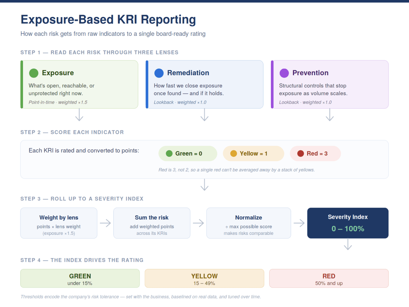
The framework reads each enterprise cybersecurity risk through three lenses.
- Exposure is the current state: what's open, reachable, or unprotected right now. It's a point-in-time snapshot taken at quarter-close, and it's the lens the board cares about most, because it answers how much risk we're holding today.
- Remediation velocity and quality is the lookback lens: once we find something, how fast do we close it, and do the fixes hold? Speed on its own isn't enough; a fast fix that doesn't stick becomes a recurring exposure.
- Prevention is the structural lens: the upstream controls that keep exposure from arising as we scale. This is where the AI-volume problem lives or dies, because prevention is what has to hold when output outpaces headcount.
We're applying those three lenses across roughly ten enterprise risks — the familiar set you’d expect, from vulnerability exposure to cloud misconfiguration, third-party compromise, unauthorized access, and social engineering, out to the newer surface of agent and execution control. Each of them carries at least one indicator pointed explicitly at AI-era exposure; not a separate "AI risk" bolted on the side, but woven into how we read each existing risk.
I’ll ground this idea with an example indicator from from each lens:
- For exposure, we're replacing patch-SLA attainment with a time-weighted critical exposure measure. For every open critical and high vulnerability at quarter-close, multiply how long it's been open by its current exploitation likelihood, sum across the set, and divide by the count. This one number rises when genuinely dangerous things sit unaddressed and falls when we clear the weaponizable ones quickly. And it moves independently of whether we technically hit SLA, which is the entire reason it exists.
- For remediation quality, we're adding recurrence rate: the share of what we close in a quarter that matches something we'd effectively closed before, same weakness class, same component. A low number means our fixes are durable. A high one means we're swatting symptoms, and no velocity metric would ever surface that.
- For prevention, we’re adding the pre-merge catch rate — the share of defects our upstream gates catch before code merges, rather than what slips through and surfaces later in production. It's an outcome measure, not a coverage one: it doesn't track how many scanners we've switched on, only whether they're actually stopping problems before they become exposure. And it scales honestly; as more code moves through the pipeline, including everything AI is now generating, the number shows whether prevention is keeping up or falling behind.
Scoring it
Once you have indicators spread across three lenses and your top risks, you have to roll them into something a board can read at a glance. This is where many risk programs lose their integrity; if you blend a dozen indicators into one summary color, judgment starts creeping into the summary itself, quarter to quarter, until the color stops meaning anything consistent.
Our roll-up is deterministic by design. The judgment lives one level down, where we set the thresholds. Once those are set, the same inputs produce the same color every time. Each indicator scores green, yellow, or red — 0, 1, and 3 points, with red deliberately more than proportional, because plain averaging would let a stack of yellows outweigh a single red, and a current exploitable exposure isn’t the sort of thing that should average away. Then each indicator's points are weighted by lens, and exposure carries a premium (we use 1.5x), because the current state of a risk should move the number more than a remediation or prevention measure of the same color.
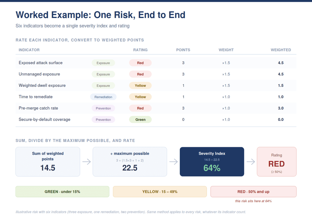
One thing I'd flag to those implementing a framework like this because it's the piece we most recently worked through. If you add up those weighted points you get a raw score, but a raw score isn't comparable across risks. A risk with eight indicators can out-score one with five for no reason other than having more indicators. So we divide each risk's score by the highest score it could possibly earn, turning it into a severity index from zero to 100%. Now every risk is measured against its own ceiling, and a risk with five indicators and a risk with nine sit on the same scale. That one normalization lets the index drive the rating: 15% or less is green, 16% to 49% is yellow, and 50% or above red.
Normalizing to an index that drives the rating is also where I part company with a popular school of thought. There's a whole discipline of cyber-risk quantification that rolls everything into an expected annual loss in dollars. I understand the appeal, it speaks the CFO's language. But I've put quantified risk in front of boards and executives, and it’s always the same: the moment a dollar figure hits the table, the conversation becomes about that figure. Someone challenges the loss estimate, someone else the likelihood, and the room spends its time litigating the model and the assumptions and inputs behind it, while the exposure it was meant to describe goes untouched. The debate becomes about the math instead of the actual exposure.
A severity index behaves differently. It's bounded, it's transparent, and it traces straight back to indicators anyone can inspect. A risk sits at 67% because these three indicators are red, not because a model estimated a loss distribution. So we do put the number in front of the board, but it opens the conversation instead of consuming it. What leads is still exposure, direction, and what we're doing about the reds. The index tells the board which risks to spend their time on and whether each one is moving the right way, and then it gets out of the way.
The hardest part isn’t the metrics
The technical work of defining indicators was the easy part. The cultural shift that has to come along with it was harder than I expected.
Security teams are trained to read a red metric one way: something we control went wrong, and it's on us to fix it. That holds true for KPIs — a red patch-SLA means the team missed. But exposure doesn't work like that. A red exposure indicator often means the company is carrying real risk right now for reasons that aren't a verdict on anyone's performance: a vendor disclosed a flaw, an actively-exploited CVE landed on a system we don't fully control, a new technique outran a control we hadn't built yet.
As we've worked these new indicators through the team, the natural reflex has been to treat every red as a personal failure, something to explain away or close by the end of the week. Analysts can often feel judged by indicators that aren't measuring their work. It's taken time, and a fair amount of me repeating myself, but the team has largely come around to the idea that a red exposure KRI isn't an accusation. It's the program doing exactly what it's supposed to do – surfacing risk so leadership can see it and decide what to do about it. The objective isn't a board deck full of green. Some of our most valuable indicators are the ones that are supposed to be red sometimes, and a team that's comfortable saying so out loud is worth more than a clean slide.
We’ve learned a few other lessons along the way, too:
- Let gray be a real answer. Where a capability is still maturing and the data isn't there yet, the right answer is to report is gray, not a default green. The urge to round up so the slide looks finished can be difficult to resist, but it’s better to have a visible coverage gap instead of hiding the gap under a reassuring color.
- Expect to baseline. It’s difficult to set an appropriate threshold until you've watched a number sit in the real world for a quarter or two, so don’t rush to set the thresholds. It’s more important to have a threshold that’s truly reflective of your organization’s risk tolerance.
- Expect to keep tuning. Setting the thresholds isn't a one-time calibration. A simple gut check helps: if the whole dashboard comes up red, they may be set too low; if it's uniformly green, they may be set too high. Either extreme usually means the scale isn't discriminating between risks the way it should. Getting it right has been an ongoing conversation between security and the rest of the business, because the thresholds are ultimately an expression of the company's risk tolerance, and that's not a line security should draw on its own.
If you build this, the indicators will take you a quarter. Teaching your team that a red exposure indicator isn't a verdict on their work will take longer, but it's worth the effort.
Ten years in, I still get the same three questions. The difference now is that when a director asks whether we're doing enough, I can trace the answer down to what's actually open and reachable — and if the answer is no, I can say so.